Website basics
Some notes on how this website works.
Golden Layout and templating
Writing the entire html for every page works but updating every page when changing something gets tedious fast.
Funktionality for Importing stylesheet and scripts straight forward.
Importing html has options:
1. Server side includes (SSI)
-->Needs server configuration
2. Client side includes (JavaScript)
-->Needs JavaScript
3. Embeding via iframes (rendering a "different page inside a div")
-->Can have styling issues
4. Build-Scripts or Static site generators
-->Can be fun but needs rebuilding every time content changes
5. Framework specific solutions (e.g. React, Vue)
-->Idk, never tried it
I use the common layout of:
Header up top.
Article and sidebar in the middle.
Footer at the bottom.
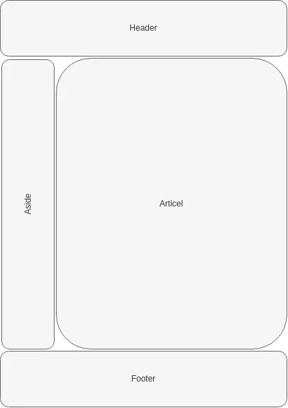
Nginx and other web servers can include External files using SSI (Server Side Includes).
All files reference the same sidebar file and the webserver "assembles" the final html on request.
The index.html for this exact page is:
<!DOCTYPE html>
        <html lang="en">
        <head>
          <meta charset="UTF-8">
          <title>Website basics</title>
          <!--#include virtual="/Template/includes.html" -->
        </head>
        <body>
        <!--#include virtual="/Template/header.html" -->
        <div id="main-wrapper">
          <!--#include virtual="/Template/sidebar.html" -->
          <!--#include virtual="main-content.html" -->
        </div>
        <!--#include virtual="/Template/footer.html" -->

        </body>
        </html>
Colapsable Grid's
This grid has two main parts:
1. The heading, its a styled button that calls a scrip.
2. A script that changes the css class of the actual grid container. From collapsed-->Expanded or the other way around.
3. The content area, with texts or anything inside it.
4. The "normal" class has a height of 0px and "expanded" having auto height.
A fallback for blocked JavaScript is provided by: 1. Adding the class "expanded" to the grid container in the html.
2. The script removes the class "expanded" on page load.
→ All grids are constantly open.
An example script is script:
HTML
<h2 id="toggleGrid1" class="grid-heading">A very good title</h2>
<div id="grid1" class="grid-container expanded">
  <div class="grid-FullWidth">
  Normal div is full with.
  </div>

  <div class="grid-card">
    <img src="example_1.png" alt="nothing to see here" style="width:auto;">
    <p>I stile the container grid-card seperatly to have a nice flexbox layout.<br>
    </p>
  </div>
  <div class="grid-card">
    <img src="example_2.png" alt="well still nothing" style="width:auto;">
    <p>Importen thext here.<br>
    </p>
  </div>
</div>
CSS
.grid-container{
      align-content:  flex-start;
      background-color: #f9f9f9;
      display: grid;
      grid-template-columns: repeat(auto-fit, minmax(300px, 1fr));
      gap: 15px;
      justify-content: space-around;

}

.grid-container:not(.expanded) {
      max-height: 0;
      overflow: hidden;
      padding: 0;
}
JavaScript
    document.addEventListener("DOMContentLoaded", function () {
      const toggleGridPairs = [
        { toggleId: "toggleGrid1", gridId: "grid1" },
        { toggleId: "toggleGrid2", gridId: "grid2" },
        { toggleId: "toggleGrid3", gridId: "grid3" }
      ];

      toggleGridPairs.forEach(({ toggleId, gridId }) => {
        const toggle = document.getElementById(toggleId);
        const grid = document.getElementById(gridId);

        if (toggle && grid) {
          toggle.addEventListener("click", () => {
            grid.classList.toggle("expanded");
          });
        }
      });
    });
Lightbox
Selecting a image and highlighting it is a staple of galery sites.
It heavily relies on JavaScript but can make a big difference in user experience.
A fallback for blocked JavaScript is provided by adding <a href="filepath.webp" target="_blank"> to the immage.
The HTML has the navigation and picture display elements always available.
The CSS the wrapper for all lightbox elements is anchored in the top left with 100% with and height to take up the entire screen. A high z-index ensures it appears above all other content.
JavaScript toggles the attribute lightbox.display = 'none' and lightbox.display = 'flex'.
Navigation can be done by using an index (numbering the images).
If you for example click on the the 3rd image, then it will:
1. Set the index to 3.
2. Set lightbox.display = 'flex'
3. The lightbox image will open the third image in an array.
→ The array of all images should be created on page load or with a build script.
4. Clicking next will increase the index by one and set the lightbox image to the new index.
There are many more features that can be added.
The next one I will probably add is to switch between a small preview image and a high res image in the lightbox.
It heavily relies on JavaScript but can make a big difference in user experience.
A fallback for blocked JavaScript is provided by adding <a href="filepath.webp" target="_blank"> to the immage.
The HTML has the navigation and picture display elements always available.
          <div id="lightbox" class="lightbox">
          <button id="close-button" class="lightbox-close">×</button>
          <button id="prev-button" class="lightbox-nav lightbox-prev">❮</button>
          <img id="lightbox-image" src="" alt="">
          <button id="next-button" class="lightbox-nav lightbox-next">❯</button>
          <button id="download-button" class="lightbox-download">Download</button>
          <div id="lightbox-text" class="lightbox-text"></div>
          </div>
The CSS the wrapper for all lightbox elements is anchored in the top left with 100% with and height to take up the entire screen. A high z-index ensures it appears above all other content.
            .lightbox {
              display: none;
              position: fixed;
              top: 0;
              left: 0;
              width: 100%;
              height: 100%;
              background-color: rgba(0, 0, 0, 0.9);
              z-index: 9999;
              justify-content: center;
              align-items: center;
              flex-direction: column;
              }
JavaScript toggles the attribute lightbox.display = 'none' and lightbox.display = 'flex'.
Navigation can be done by using an index (numbering the images).
If you for example click on the the 3rd image, then it will:
1. Set the index to 3.
2. Set lightbox.display = 'flex'
3. The lightbox image will open the third image in an array.
→ The array of all images should be created on page load or with a build script.
4. Clicking next will increase the index by one and set the lightbox image to the new index.
There are many more features that can be added.
The next one I will probably add is to switch between a small preview image and a high res image in the lightbox.
Reducing Total Blocking Time (TBT)
Nothing is faster than the speed of light.
Except the inpatience of a user, they will complain even if the site loads with lightspeed.
I focus on two milestones:
1. Get the eye-candy out, let the user see something, let them interact with it. (Time to First Contentful Paint - FCP)
2. Start videos, render images in full resolution and load all functionality (Time to Interactive - TTI)
Goals are good, lets start by quantifying it!
Press F12, select Network and reload.→ Files, file sizes, transport size and load times are shown.
Please note that the first load needs to fetch every resource.
The second load shows some files with 0ms, these are cached.
External tools like debugbear can also help analyze performance.
The first 14kb
Linux server is usually configured that "TCP Slow start" sends up to 10 unacknowledged packets before waiting for an acknowledgment.The transmission rate will be increased by the slow-start algorithm until either a packet loss is detected or a limit is reached.
We need to keep the initial HTML file below 14kb to fit into these 10 packets for a http request
Modern browsers use https and send at least 2 packets for the TLS handshake.
→ It is impossibe to only have one request and awnser with the complete page.
The 14kb are my personal benchmark but not a hard limit.
Critical resources
The browser only renders the page after reaching the end off the HTML document.Files included with the <style> or <script> tags are also loaded and blocking the rendering.
Including CSS and JavaScript inline allows the first render to happen as soon as the first document is parced.
I use server side includes to be able to work with sorted document and serve them all inline
The unimportant JavaScript use the <script defer> attribute, loading only starts after first paint. The intor Videos first load a placeholder immage and immages utalize lazy loading.
1. What is critical?
3. Lazy loading
Most browsers load all pictures on a website simultaniosl by default.
That can lead to many half loaded pictures on my galery site.
The easyest option to improve it is to use the lazy loading attribute.
<img loading="lazy" src="image.jpg" alt="..." />→ improving initial load time but adding a slight delay when a opening a grid.
Another option is to suppress loading images with JavaScript one after the other.
That maximizes the bandwidth usage but needs code and I don't want to maintain that here ^^
Reducing file size
Caching files